So where did this crazy project come from?
I've been programming literally my whole life, since preschool, typing in BASIC programs from computer magazines and library books. Graphics and animation were always my favorite part, starting with simple sprites in GW-Basic. My peak as a graphics programmer was in high school, working in assembly language on VGA hardware in MS-DOS. I particularly loved learning about and reimplementing some of the graphical effects that came from the PC demo scene. Later, I made and released an Atari 2600 console game. But I didn't keep up with the advancing technology of 3d acceleration and modeling and texturing, and my interest in the field waned.
But then as a brony, watching the amazing art and video creations from the pony fan community, I started wondering about how to contribute something of my own. But not a typical music video with canned effects, or Flash animation with character puppet rigs, both of which are already plentiful and strike me as more tedious than fun. The video Dork in particular started a few embers of thought smoldering. Object motion. Maybe I could do something like that. That's where my programming skills could produce something different, setting my work apart from other Flash animations and PMVs. The thought was at the back of my mind for a few months. But I didn't yet have enough inspiration.
Big Apple Ponycon in March 2013 (on my birthday) brought me that inspiration. A friend and I were watching one of the music acts while Dork was playing on a video screen. I'd seen Dork before, but again started thinking of how I might produce something like that. Object motion, such as effects from the early PC demoscene... The whole idea suddenly exploded in my mind. Literally revisit the demoscene and collide it with the ponies. I could remake the premier oldschool demo, the most widely known and best of its time, Second Reality. With My Little Pony content. Call it Second Realipony.
I furiously spent the next hour in the auditorium at the convention scribbling out ideas and storyboards for adapting the scenes of Second Reality to our beloved ponies.
Here's my comments on developing the specific scenes.
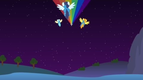
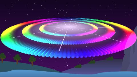
I almost decided to omit the whole lengthy introduction entirely, to start at the title screen instead. But then while coding the Rainbow Dash section, I was organizing the code into phases for the different rainbow spinners. I strained really hard to actually fit "Phase 3: Sonic Rainboom" there, but it just didn't work. But I gotta get a sonic rainboom in the show somewhere... oh - of course! - there's an explosion right in the intro! Perfect. And the one big and three small spaceships of Second Reality easily became Dash trailing a rainbow then the three Wonderbolts.
I know my rainboom doesn't quite look like the show - but also, rainbooms are drawn very inconsistently in the show with many different looks and animation elements. I decided not to worry about that and just go with my own design. I also drew the landscape myself; didn't need anything fancy, just something that looked vaguely like the show. I originally intended to draw Canterlot on the mountain, but that became really complicated and time-consuming so left it out.
(And yeah, I clipped out a few phrases of music in order to shorten the scene and get the action started sooner. Sorry, Skaven.)
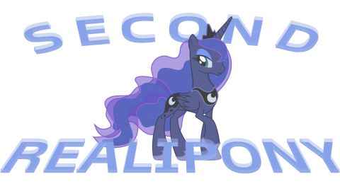
For the title screen, what I originally wanted was the Mane Six photo from the real FIM opening, filtered to bluescale to look like Second Reality's art. But I couldn't find a good enough source image of it. And I also realized how inaccurate it is - ponies are missing tails, eyes are pointing the wrong way. Instead, I decided to simplify my screen to a single character with readily available art. Luna was the right fit, since she didn't appear elsewhere in the show, and also her blue color scheme approximates the Second Reality original. The text was done in Inkscape using the motion extension to create the 3D, plus path and perspective transforms.
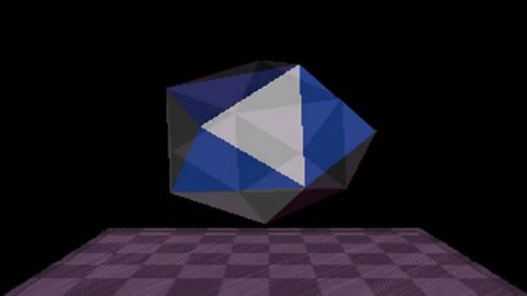
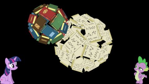
Twilight Sparkle was actually the last scene I designed. In storyboarding, all the other ponies found homes fairly quickly, and Twilight ended up here mostly by default. For a long time, I didn't know what to do here. Spinning polyhedrons were a lot more interesting in 1993, not so much in 2013. The object could be a book, but that wouldn't be interesting enough for the lead scene at the top of the show here. I even considered swapping Applejack here instead, since an apple would make a fine 3d object.
But it finally came to me: make the polyhedron not just a book, but constructed out of many books for each face. Then the second polyhedron could follow the same approach, using letters to the Princess, which was also a good excuse to include Spike in the action too. Yes, the technical aspects of this scene diverge from Second Reality more than any other. But that was necessary to create an overall scene composition good and interesting enough for the headliner act.
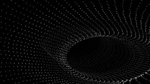
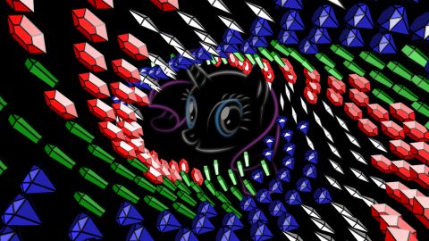
Rarity was the very first section that clicked in my mind and made me want to do this whole crazy project. I immediately had it in my head to remake this scene with Rarity's gems in place of the dots. The dot tunnel effect was always my favorite scene in Second Reality. I spent dozens of hours back in the day trying to replicate it in code myself, but never really succeeded, thanks to lacking any real understanding of 3d space and geometry and rendering. But now was my chance to get it right and I did.
The Rarity image on screen is a departure from Second Reality. I put that there just in case the purpose of the gems wasn't quite obvious, and also for the image to serve as a source for the pulsing effect at the end. Rarity couldn't remain on screen: the tunnel effect requires the impression of freely moving through space and doesn't work right if it looks like there's a wall at the far end. So I used the glowing stylized art briefly instead, which was inspired by the scene in Six.
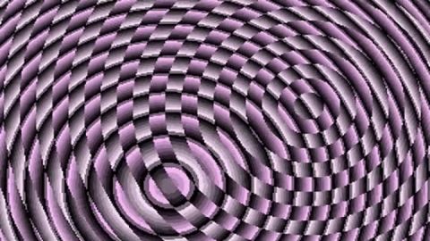
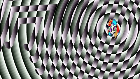
Vinyl Scratch's segment came together pretty late. I had no idea what to do with this section at first, since it's so abstract. Then while watching the "Bronies" documentary, I was struck by all the animated wipes involving the cutie marks. Maybe this section could be the six cutie marks swirling around giving off the lines... nah that would be too crowded, but there's a germ of an idea there.
Then I examined Second Reality more deeply to see how it operated. There's one pulsing circle, and one set of contour lines that invert the output from the circle. So I needed just one cutie mark. Which pony is appropriate for a pulsing techno lightshow and has a nicely linear cutie mark to create lines? Vinyl Scratch of course. This looked great almost from the very first run.
The contour lines in Second Reality do some pretty snazzy warping effects too, which I didn't want to try to replicate, but mine needed some animation. Just scaling and tilting with the beat worked fine. Finally, I also needed to get the pony herself onscreen and interacting with the animation, as with the other sections. On such a busy screen, about the only thing that worked was just sticking in her head on the pulsing circle.
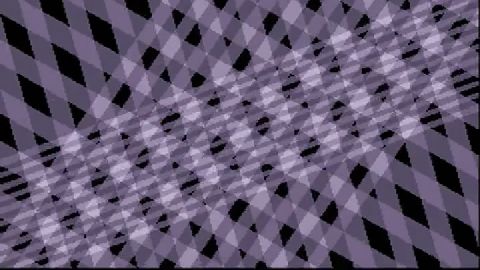
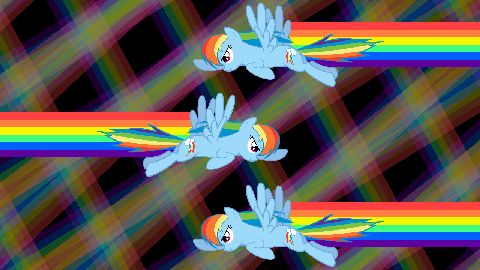
Rainbow Dash was the second section I thought of (after Rarity), and the first that I coded, thanks to its 2D simplicity before learning the 3D parts of XNA. Making the light beams of Second Reality into Dash's rainbows was a pretty obvious idea. I programmed the rainbows first, then decided the scene needed to get Dash onscreen too, so had her draw in the rainbow trails. Like with Rarity, keeping RD onscreen would distract and steal punch from the rainbow effects, so it worked best to have her fly by and leave. She gets enough screen time from flying in the three separate rainbow phases.
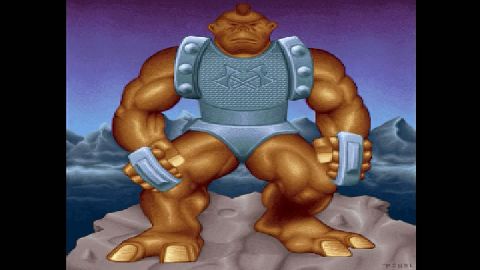
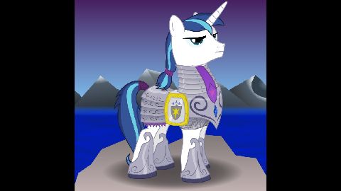
Obviously the focus here is the art, not animation. (Although the animation was fun to code anyway, with the shimmying motion, smash with the orchestral sting, and television-like collapse and fade.) I felt strongly this needed to be one of the male ponies to give the right vibe like Second Reality's original image. Candidates were Celestia's guards and Big Mac, but the strongest male in the show is Shining Armor and he had to go here. It sure helped that a perfect picture was available, with the pony wearing armor and even sporting the same expression as Ulik in Second Reality.
I added Shining Armor's background myself in Inkscape. I'm barely competent as an artist, so it's not nearly as detailed as the original by Future Crew's Pixel, but good enough for this.
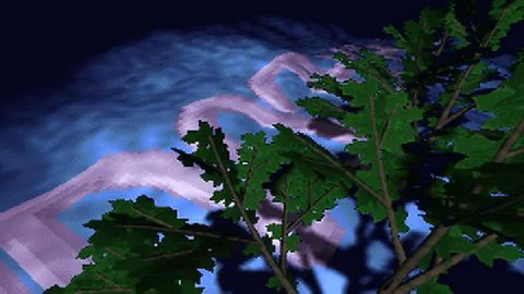
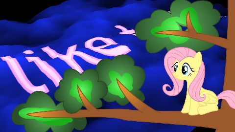
This part was totally obvious right from my first pass at storyboarding. It's the sole calm and quiet part of the whole demonstration. And it already had a tree! Couldn't possibly be anything other than Fluttershy. The soft pink text color even matches Fluttershy's mane.
The tricky bit here was drawing the tree, of all things. I spent a long time trying to draw it with individual leaves, to show off the leaf textures, as Second Reality does. That worked terribly; the drawing was never convincing, and scaling was a serious problem: if the leaves are big enough to see the texture then the scale is all wrong compared to Fluttershy herself. Finally I went with a more abstract tree drawing closer to the style of the show.
For anyone interested in the technical detail, the rough surface is generated with a Perlin noise algorithm. The noise is used as a heightmap for an otherwise flat mesh sheet of vertices, and the texture coordinates for the text scroll across the sheet. (Take THAT, ordinary pony typography videos. Just like Future Crew was lightly jabbing at overly text-heavy demos of that time.)
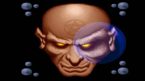
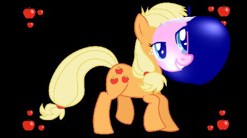
Applejack's scene came together quickly also. The first inspiration may have been the fact that Applejack has the same color scheme as Second Reality's demon head. The lens effect naturally became an apple, which was quite interesting to work out the optical mathematics in code. And it's fitting for Applejack, the boring pony of the mane six, to have what's probably the least exciting scene of the show in the lengthy spinning section. I did decide that it worked better to show a full body side view of AJ rather than just a gigantic pony head.
(Incidentally, Applejack started moving up my favorite pony lists just thanks to the flexibility of apples as 3D objects. I considered putting her in each of the scenes that became Twilight, Vinyl, and Pinkie, just because apples would work well for any of those objects and shapes.)
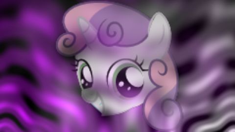
It was pretty late in the project before I figured out what to do with this section. The plasma effect in Second Reality is impressive mostly for highly technical reasons, which doesn't translate well to a modern remake for a pony audience. And it's really abstract, how can this be ponified at all?
I wanted to get the Cutie Mark Crusaders in the show somewhere. The link here actually just came from the number 3. There's three crusaders, what in Second Reality comes in a group of three? The three plasma scenes. Then I somehow thought to have the plasma waves coalesce into the CMC portraits. (With Apple Bloom, the least interesting CMC, getting the shorter segment last.)
I adapted the plasma behavior for my show, using two color channels instead of Second Reality's three, to match each CMC's hair and coat colors. Since each color pair is fairly close to each other in color space, they don't blend well and wash out when overlapping, so I set them up with more spatial separation emanating from the lower corners. Then there's a third channel that defines the opacity of the CMC texel, which emanates from bottom center and ramps up with time.
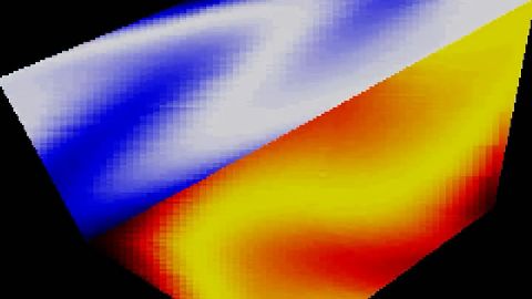
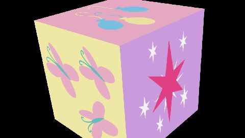
Hey, it's a cube. This idea came almost directly from Dork. The obvious thing to put on a six-sided cube is the six cutie marks. I was a bit worried about overly ripping off Dork with cutie mark animation, but turned out I didn't use cutie marks anywhere else in the show so this one segment was okay. I considered also adding a plasma wave texture like Second Reality has on the cube, but my friend pjabrony acting as creative consultant said that just the animated cutie marks were enough to carry the scene.
The technical secret is in how the cutie mark art is separated on a sprite sheet, so that each individual element can be manipulated in code. See here on DeviantArt.
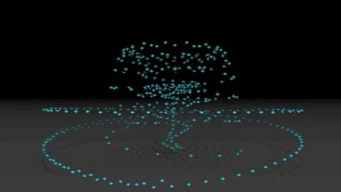
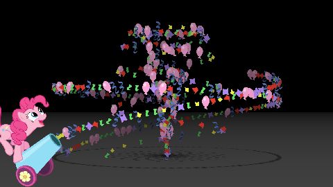
My first thought for this scene was actually Parasprites whirling around. But after a first pass over the storyboard, I hadn't slotted Pinkie in anywhere yet and she fit perfectly here. The whirling dots easily became party confetti and streamers and balloons, going along perfectly with the "Hey! Hey! Hey!" soundtrack. And this was a great spot to truly have a pony onscreen interacting with the animation, starting the scene with Pinkie firing the party cannon. I was able to reproduce the object paths from Second Reality quite closely just by looking at it frame by frame and doing the calculations with cylindrical coordinates.
I love how this scene turned out. It's a truism in graphics coding and animation that you usually end up with effects that look about half as good as you envisioned in your mind. But this scene in motion came out looking even better than I'd expected.
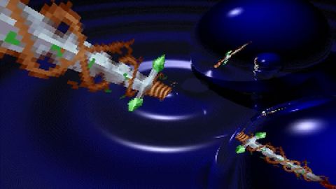
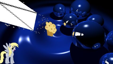
The raytracing scene went through a few ideas, but settled on a good one. At Big Apple Ponycon when I conceived this project, Double Rainboom debuted. The scene with Derpy got huge cheers from the audience. I had to get this fan favorite into my show somewhere. But not early, needs to be properly timed to invoke the "omg ♥ Derpy!" surprise reaction. This segment was perfect: late in the show, allows the slow reveal, Derpy has enough associated objects (mail and muffins) to send through the portal, and finally it even worked to keep the pixelated texture of the objects as a nod to Derpy's popularity in pixel art.
I even hit on arranging the spheres like Derpy's bubbles in her cutie mark. Perfect: that integrates the scene with Derpy, gives a clue towards her presence from the beginning before the reveal, but it's not obvious just yet.
Finally, I quite enjoy the juxtaposition that the slow-witted Derpy got the most mathematically complex scene in the show. Raytracing. The point of the graphical effect is all of the pixel-perfect reflections. For every pixel on the screen, calculate a ray emanating from the camera through 3D space, reflecting it off any number of spheres. It may collide with the floor or disappear off into space, in which case we calculate the lighting based on the angle to the light source. Then there is a second pass of raytracing to look for collisions with the plane where the "transmission" texture moves, which are handled separately as a set of moving texture coordinates on each sphere.
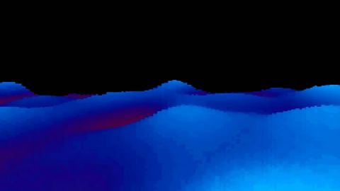
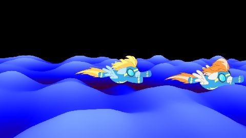
I had the waves effect working pretty quickly and looking good, but it took me a long time to figure out how to ponify yet another very abstract scene. Then I was showing an early draft of the video to my siblings, asking for suggestions. Someone said something that inspired me to connect the Wonderbolts into this scene, carving shockwave channels through the waves, which came out pretty well in the end.
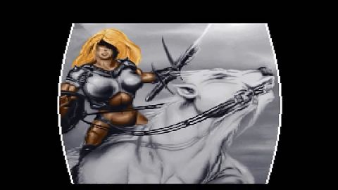
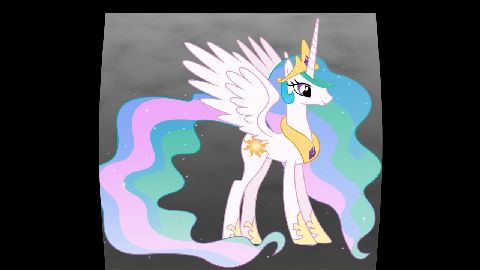
Second Reality has a white horse here, and of course Equestria's beloved white horse is her majesty Princess Celestia. The bouncing effect was fun to code.
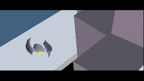
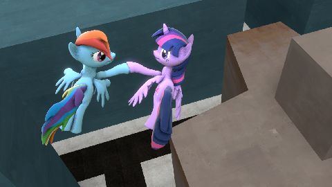
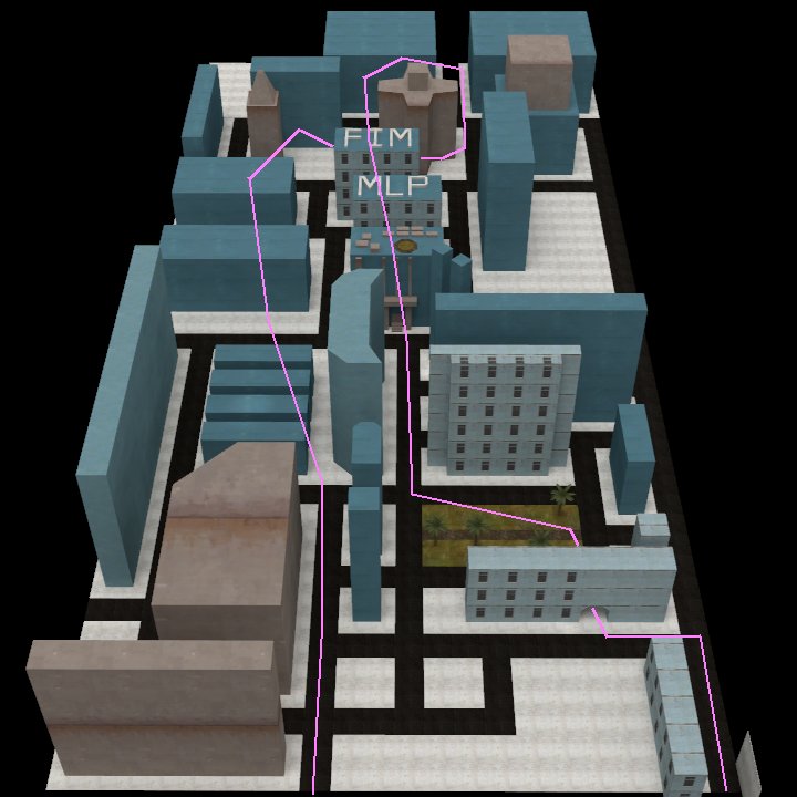
Okay, I didn't code this one. It's obviously Source Filmmaker. See, Second Reality's city world scene was mindblowing in 1993, as the first fully polygonal 3D world running in realtime on a regular PC. But in 2013, it's completely ordinary. No way could I produce any technical wizardry as remotely impressive as the original was in its time. I could recreate and render the cityscape in XNA, but complicated 3D modeling and posing is beyond my capabilities.
So I resorted to Source Filmmaker. This would at least produce a similar viewing experience as the original, where the cityscape 3D scene suddenly leaps to a new level of technology beyond the rest of the show. Even if I didn't code it myself. And SFM certainly has technical challenges in its own right, in building the map in Hammer and getting the lighting to look right, and in smoothly animating the pony models. So it's a worthy component of the show even if it's not quite true to the spirit of the demoscene.
It took a while before deciding on Alicorn Twilight as the lead pony in place of Second Reality's little spaceship. Rainbow Dash was my first thought, but she just didn't feel majestic enough. This scene could only be worthy of a princess, but Celestia and Luna models take an enormous amount of work to animate the flowing manes and tails. That left Twilight. But she really did fit well into the pacing and dynamics of the scene, starting out with a slow and tentative flight then suddenly soaring aloft.
The other ponies entered because I still had to have Rainbow Dash onscreen for a cameo. And then it wasn't right to have just one additional pony, needed all the mane six. The others didn't have to do very much, except of course Pinkie Pie had to be bouncing around because Pinkie.
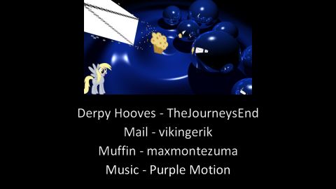
And we wrap up with the same credits sequence as Second Reality, in which I take careful care to credit all the wonderful artists whose work I appropriated, including Future Crew's amazing musicians.
Finally, some assorted technical comments.
Video format: 1280 x 720 HD. Accept no less, that's the standard for video publishing nowadays. Part of what I'm doing is remaking Second Reality itself with high-resolution versions of the effects, especially Derpy's raytracing and the city scene. I did a little bit of work at 1920 x 1080, but the enormous image sizes (8 MB per full screen texture!) got unwieldy. And my monitor is 1600 x 1200, which made 1920-wide difficult to work with.
Technical platform: Microsoft XNA. I dabbled with Flash ActionScript a bit, before realizing that this project was already ambitious enough without adding the task of learning a new environment and language too. I love C# as a language and know it well, which led me to XNA Game Studio as the way to hook C# up with 3D programming. Yeah, using XNA to drive a DirectX 9 video card is tremendous overkill to replicate what should be done in four megabytes of memory and a 64k VGA frame buffer. And I have no need for Xbox portability. But XNA made it amazingly easy to get started, with excellent abstractions for handling the models and matrices and transformations of 3D programming. So that was my tool of choice.
Timing: My unit of time is the beat. The music, being a tracker module, runs at a constant precise rocksteady rate of 130 bpm. So I convert seconds to beats and use that for all the timing: the pulses of Rainbow's rainbows, the gems of Rarity, the bounces of Twilight's books, Pinkie's cannon firing on "Hey!", the start and end and fadeout times of each segment; everything gets synched to beats. Every segment also runs as a pure function of time: there is no state persisted between frames, so that any segment can render on demand at any arbitrarily fine time interval. This architecture made it possible to easily render at any frame rate, and to jump ahead for testing any particular moment in the animation.
Audio: I chopped the audio into tracks precisely on the beat boundaries, by calculating the time points exactly with an Excel sheet then splicing that into an Audacity project to export into multiple tracks. So each scene as the C# program runs can begin playing its own music track exactly in synch at its beat zero. This results in each boundary between audio segments either overlapping or gapping by a few milliseconds, but this is inaudible in the final result. Then for the final mix, I have another Audacity project to reassemble the wave files each starting at a precise frame offset, into a final audio stream.
Video rendering: I wrote code in XNA to control my own timing and ignore the framework's, so I can make sure every segment draws every frame at precise 1/60 second intervals. Then save every frame as a screenshot to a PNG file. Finally, use FFmpeg to encode the image sequence together with the audio into the final movie. The output from Source Filmmaker for the city scene comes the same way, at 1280 x 720 exported to an image sequence, so I rename these frames into numerical sequence and FFmpeg picks them up into the same stream.
Source Filmmaker: The biggest chunk of work here was mapping out Second Reality's city and recreating it in Valve's Hammer level editor. I approximated the colors of the original buildings, using textures for a richer look rather than flat colors. The pony animations are pretty standard SFM modeling stuff, I don't have anything to say there that you wouldn't find in other tutorials online. One detail is a spotlight that hovers above Twilight and moves with her, to create that rich glossy lighting look.
Making this scene also fulfilled a long-held itch: I always wanted to see the city layout of Second Reality from a wide-angle overview and now I have. Here you go too, with the flight path marked.
